Your industry shapes your logistics needs. We help you meet the demands - whether it’s fast‑moving e‑commerce, complex industrial flows or bulk handling. Explore solutions tailored to your reality.
Logistics is a strategic matter. We help you create business value with innovative, sustainable logistics solutions you can rely on completely. We’ll take care of it!
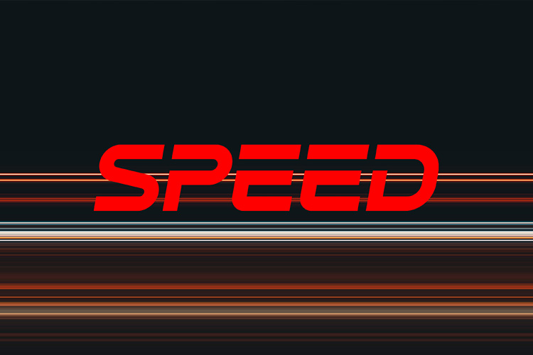
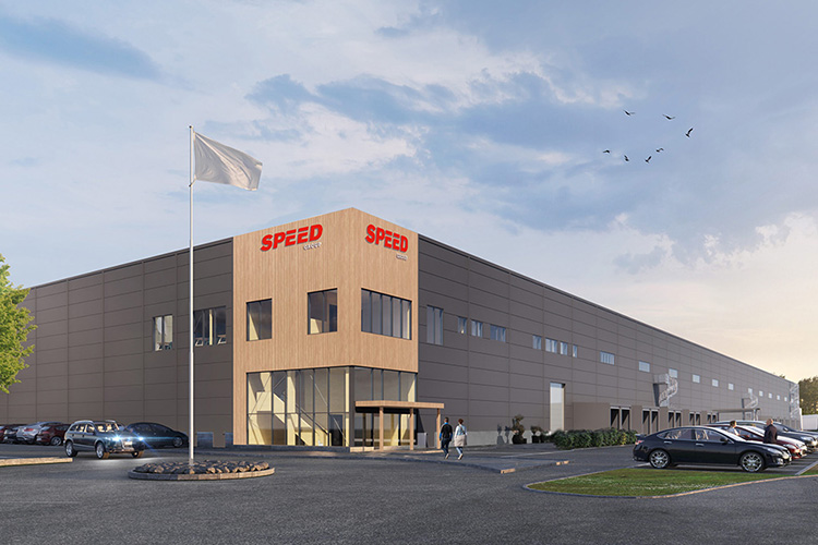
We can finally show you what Speed looks like as of today. We've freshened up the colors, streamlined the logo, and created a website that truly feels like us. All to make it easier and clearer to meet Speed, no matter where you meet us. It's not a total makeover. It's still us. Just a version that's a little sharper, a little livelier, and a lot more Speed.
Why do we do it?
Because we've evolved. When we streamlined the business and established a clear focus on logistics, we felt that our expression needed to follow.
Nothing dramatic. No big words. Just an update that better reflects the Speed our customers meet every day.
Clear. Simple. Quick to understand.
What's new?
A lot has been tweaked in small ways, but together it makes a noticeable differencence.
We've modernized our logo and removed the "Group", in line with how everyone already talks about us. We've introduced new colors, many in the red spectrum, simply a little more Speed. And we're proud to present a brand-new website. Simpler, clearer, and faster. We hope that you, like us, think it looks a whole lot better.
Same Speed, just a little new energy
We're not changing who we are. We continue to deliver safe and smooth logistics, just like before. But now with an expression that fits the times.
More 2026. More us. And we are genuinely happy to finally show it.